If you’ve ever been involved in an accessibility test, you’ve probably realised that much of the internet isn’t very accessible. However, making applications and websites more accessible is easier than many people think and – especially if you get a chance to witness an accessibility test yourself – it’s very rewarding too.
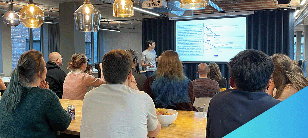
My colleague Jonathan Price recently ran an event on digital accessibility in our Manchester office. After first sharing some key lessons from his experiences, he presented a fictitious and inaccessible website – “a11yJet” (a11y is shorthand for ‘accessibility’, though usually in the context of creating accessible content – not consuming it). Over pizza, we were then invited to work together to fix it – and now you can have a go as well. I’ll explain how below.
Jonathan’s four accessibility takeaways
Most of Jonathan’s lessons were about challenging our preconceptions of what it means to develop accessible applications – with the recurring theme being: it’s probably less technical than you think, and more about users than you think.
To make this case, Jonathan started by taking us through some results from a real-world accessibility test.
1. Digital accessibility is as much about design and content as it is about development
There are ways developers can write code to make applications more accessible, but once you start accessibility-testing your application with real users, you find that’s not the full picture.
For example, when it comes to page design: wide, multi-column layouts can look beautiful at 100% zoom, but for a user who’s visually impaired and navigating the internet at 400% zoom, you risk truncating key content off the sides of their screen.
Or if your content uses short headers and links, like “Try it yourself” or “click here for more”, that might look neat to a fully sighted user, but someone who is blind and using a screen reader might navigate your content by headers or links alone – and they’ll miss the visual context. A more descriptive header might be “Try fixing a website’s accessibility for yourself”, and a more descriptive link might be “try the W3C Developing for Web Accessibility guide for more”.
2. Accessibility isn’t all about screen readers, but…
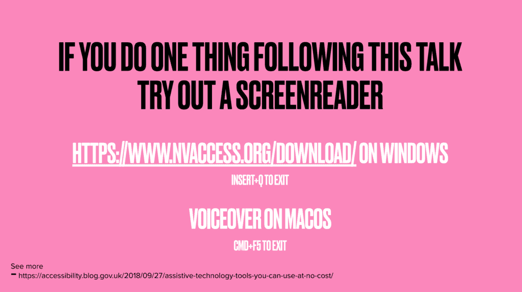
Screen readers aren’t the only form of assistive technology, and users who are blind aren’t the only users with accessibility needs. However, if you build an application that can be used with a screen reader, it’s very likely that:
- It’s also keyboard navigable
- It’s well-structured
- It’s easy to understand
- It’s usable even when images fail to load over poor network connections
While some of the most popular screen readers have a cost, this gov.uk blog on assistive technology tools suggests some free alternatives.
3. Worry less about aria attributes, and more about different users’ needs
There are loads of aria attributes, which can make accessibility seem intimidating to developers. But aria is mostly for edge-cases, and if you write “normal” HTML, then lots of accessibility takes care of itself.
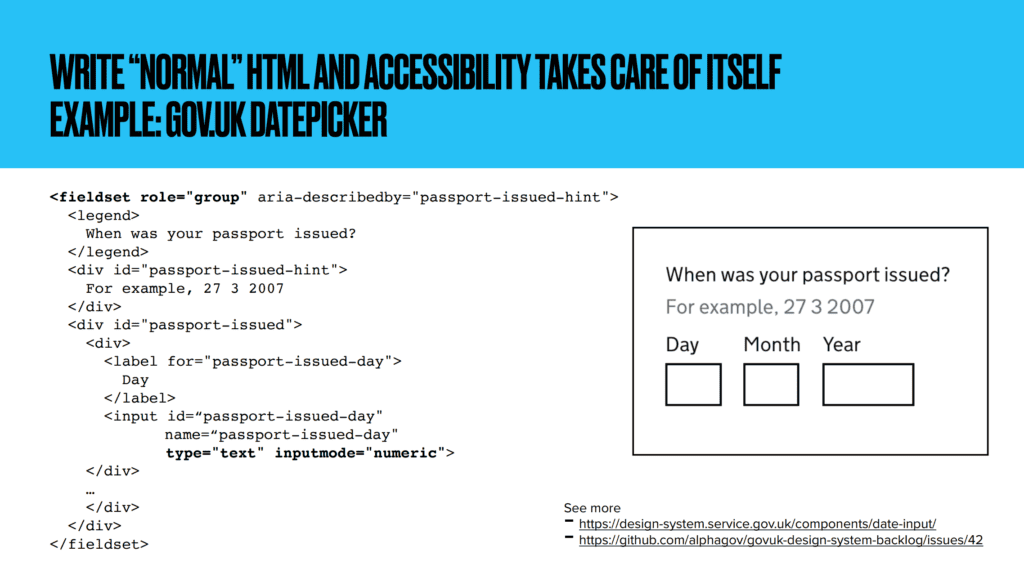
So, it’s better – and less intimidating – to think about the needs of different users, for example:
- Colour-blindness making it hard to differentiate between certain colours, e.g. red and green
- Visual impairment leading to use of a screen reader or magnifier
- Repetitive strain injury making use of a mouse painful
- Epilepsy causing reactions to flickering images
For a more comprehensive list of needs try the W3C Diverse Abilities and Barriers guide, or the W3C Stories of Web Users explores the same issues as short stories.
Start testing for these needs – for example, testing keyboard navigation for users who struggle to use a mouse – and it’ll quickly become clear whether you’re on the right path.
4. Accessibility-testing tools help (but they’re not perfect)
There’s no substitute for manual accessibility testing (yet!), but there is a bunch of tools that can help. You can test the basics – such as colour issues or mobile touch targets that are too small – with tools including:
- Google Accessibility Scanner for Android
- Google Lighthouse
- Deque axe
- Your favourite browser’s developer tools
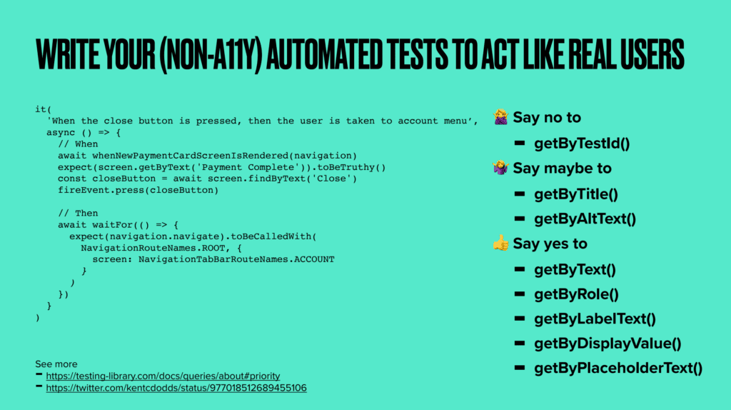
You can also write your regular automated tests to act like real users – for example, try writing your tests to find HTML elements by text (which is human readable) rather than IDs (which are only computer readable). The Testing Library Queries guide lists different ways for your tests to query your HTML that best reflect users of assistive technology.
Try fixing a website’s accessibility yourself
Since the event, Jonathan has tidied up a11yJet and made it live for everyone to try: https://www.a11yjet.com/
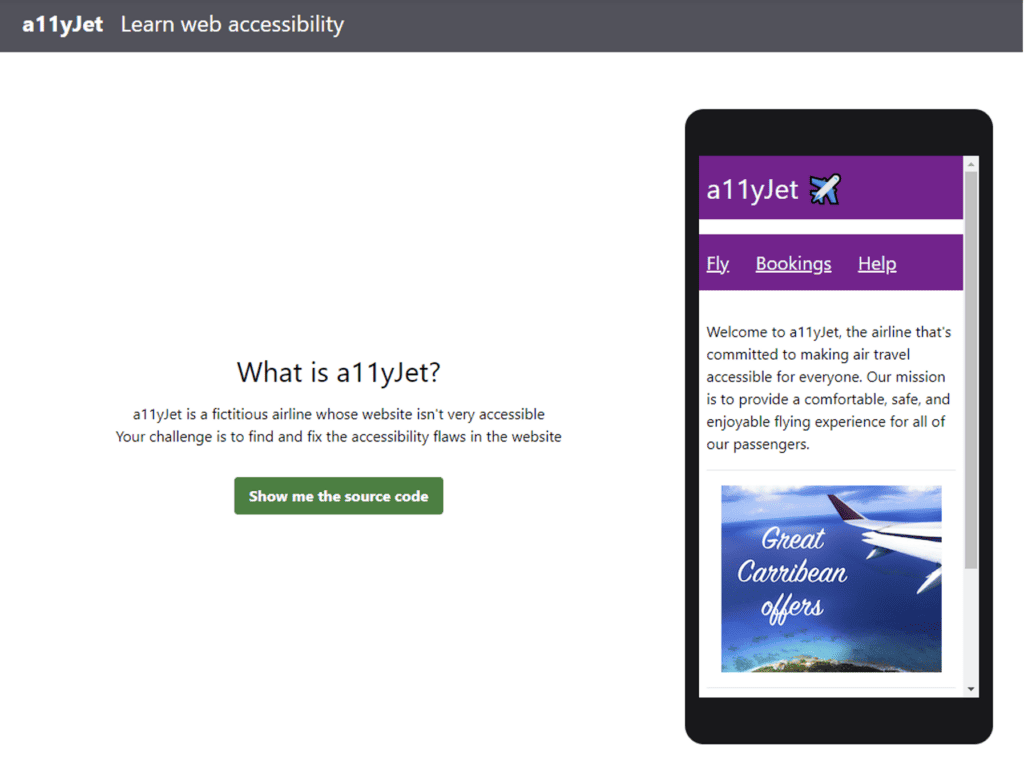
If you missed the event, here’s how it works:
- A11yJet is divided into several levels
- Each level contains a few accessibility problems for you to fix, plus a few hints in case you get stuck
- You can fix the code directly in your browser, and you need to keep fixing until all the tests pass
A11yJet was intended as a group activity, but you can tackle it on your own too. Just keep in mind: it’s written for developers with a bit of web and accessibility experience already. If you’re completely new to web accessibility, you might want to review some of the basics first. The W3C Developing for Web Accessibility guide is a good place to start.
